Black Friday Sales Analysis Project - Python Jupyter Notebook
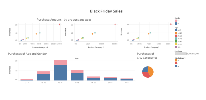
In this data analysis project, we embarked on a journey to unravel the intricacies of customer purchase behavior, specifically focusing on purchase amounts concerning various products across different categories. Leveraging the Black Friday Sales dataset from Kaggle, our exploration began with the essential step of importing libraries for data analysis, including pandas, matplotlib, seaborn, and scikit-learn. The datasets were loaded, and a comprehensive overview of the data was obtained through descriptive statistics.
To enhance our analysis, we addressed data preprocessing tasks such as dropping unnecessary columns, converting categorical values into numerical ones, and handling missing values in the Product_Category_2 and Product_Category_3 columns. Additionally, we transformed the 'Stay_In_Current_City_Years' column to ensure uniformity.
Moving forward, we delved into data visualization, using seaborn and matplotlib to create insightful visualizations. We explored the impact of gender, age, occupation, and product categories on purchase amounts. Heatmaps were employed to examine correlations between different features.
You may find the datasets I used at the following location: https://www.kaggle.com/datasets/pranavuikey/black-friday-sales-eda
As always, I will start by uploading the necessary libraries:
#IMPORT LIBRARIES
import pandas as pdfrom pandas.plotting import scatter_matrix
import matplotlib.pyplot as plt
from sklearn import model_selection from sklearn.metrics import classification_reportfrom sklearn.metrics import confusion_matrixfrom sklearn.metrics import accuracy_scorefrom sklearn.linear_model import LogisticRegressionfrom sklearn.neighbors import KNeighborsClassifierfrom sklearn.discriminant_analysis import LinearDiscriminantAnalysisfrom sklearn.naive_bayes import GaussianNBfrom sklearn.svm import SVC
import seaborn as snsfrom sklearn.tree import DecisionTreeClassifierfrom sklearn.model_selection import train_test_split
import plotly.express as pximport numpy as np
get_ipython().run_line_magic('matplotlib', 'inline')
Now I will upload the datasets and will try to get to know the data.
dstrain = pd.read_csv ("DStrain.csv")
dstrain.head
dstest= pd.read_csv ("DStest.csv")
dstest.head
dstrain.describe().T
dstest.describe().T
Merge train and test data / not using merge
ds=dstrain.append(dstest)
ds.head()
ds.info()
ds.describe().T
I don't need the column called "User ID"
ds.drop(['User_ID'],axis=1,inplace=True)
ds.head()
Categorical values needs to be numerical values
ds['Gender']=pd.get_dummies(ds['Gender'],drop_first=1)
ds.head(10)
ds['Age'].unique()
pd.get_dummies(ds['Age'],drop_first=True)
ds['Age']=ds['Age'].map({'0-17':1,'18-25':2,'26-35':3,'36-45':4,'46-50':5,'51-55':6,'55+':7})
ds.head()
ds_city=pd.get_dummies(ds['City_Category'],drop_first=True)
ds_city.head()
ds=pd.concat([ds,ds_city],axis=1)
ds.head()
ds.drop('City_Category',axis=1,inplace=True)
ds.head(10)
Handling Missing Values / not the purchase value but the product category 1 and 2
ds.isnull().sum()
ds['Product_Category_2'].unique()
ds['Product_Category_2'].value_counts()
ds['Product_Category_2'].mode()[0]
ds['Product_Category_2']=ds['Product_Category_2'].fillna(ds['Product_Category_2'].mode()[0])
ds['Product_Category_2'].isnull().sum()
ds['Product_Category_3'].unique()
ds['Product_Category_3'].value_counts()
ds['Product_Category_3']=ds['Product_Category_3'].fillna(ds['Product_Category_3'].mode()[0])
ds.head()
ds['Stay_In_Current_City_Years'].unique()
replacing 4+ with 4
ds['Stay_In_Current_City_Years']=ds['Stay_In_Current_City_Years'].str.replace('+','')
ds.head()
ds.info()
ds['Stay_In_Current_City_Years']=ds['Stay_In_Current_City_Years'].astype(int)
ds.info()
ds['B']=ds['B'].astype(int)
ds['C']=ds['C'].astype(int)
ds.info()
Data VISUALIZING
sns.barplot('Age','Purchase',hue='Gender',data=ds)
ds['Gender'].unique()
sns.histplot(x='Purchase', data=ds, kde=True, hue='Gender')
plt.show()
sns.barplot('Occupation','Purchase',hue='Gender',data=ds)
ds['Occupation'].unique()
sns.barplot('Product_Category_1','Purchase',hue='Gender',data=ds)
sns.barplot('Product_Category_2','Purchase',hue='Gender',data=ds)
sns.barplot('Product_Category_3','Purchase',hue='Gender',data=ds)
sns.heatmap(ds.corr(),annot=True)
plt.show()
Conclusion
This project not only provided valuable insights into customer purchasing patterns but also showcased the importance of data preprocessing and visualization in extracting meaningful information. As we navigate the landscape of data science, this analysis serves as a testament to the power of Python and its libraries in uncovering hidden trends within datasets.
If you have any questions or would like further clarification on the steps taken in this analysis, please feel free to reach out. I'm here to assist and provide additional insights into the fascinating world of data science.
stay insightful xx
- irem